
Website experience · emerging browser technology
A browser assistant cannot rescue a confusing enquiry or booking flow. The useful response to WebMCP is not a speculative rebuild; it is to make the customer journey clear enough that a person—or a future assistant acting for them—can complete it without guessing.
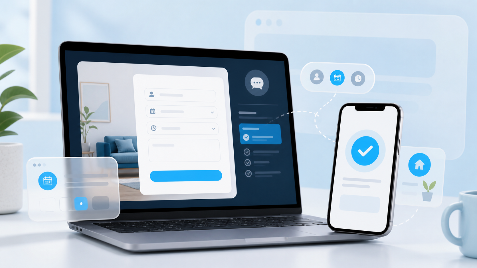
Why WebMCP matters—and why it is not urgent for every site
Chrome introduced WebMCP as an early web-standard proposal for giving browser-based assistants a structured way to work with website functions and forms. It is an important direction of travel, not a universal customer requirement or a reason to replace a working website this month.
The practical change is easier to understand than the name. Today, a person often has to interpret a page visually: which field is the right one, whether a button submits a request or merely opens another step, and what happened after pressing it. A browser assistant faces the same ambiguity, but cannot use common sense to repair a vague label or a hidden condition.
That makes the near-term decision straightforward. A business does not need to promise automated bookings or hand over complex customer decisions. It needs a website whose normal interactions describe themselves accurately.
Start with one journey that earns money
Choose the route closest to a real commercial outcome: a consultation request, a quote form, a booking, a product checkout or a newsletter sign-up that feeds a sales process. Do not begin with the homepage. The question is whether a new visitor can tell what the page asks for, why it asks, and what will happen next.
A worked example: the consultation request
Situation: a local service business has a “Book a call” button. The form asks for a name, email, a dropdown called “type”, and a large empty box. After submission, the page refreshes with no clear confirmation.
What goes wrong: a visitor may not know whether “type” means service, urgency or customer category. The empty box invites an essay but gives no indication of what information helps. The refresh makes it unclear whether the request was received. A browser assistant would face the same missing context.
Better version: label the dropdown “What do you need help with?”, name the available services in plain language, give the message box a short prompt such as “Tell us the goal, location and preferred timing”, and show a confirmation that states the next response time. The form becomes easier to complete without collecting more data.
Three decisions that make a form easier to trust
Make each field answer a real customer question
A label is not decoration. “Phone” tells a visitor what to enter; “Phone number so we can confirm a same-day appointment” explains the trade-off. Avoid placeholder-only labels, invented abbreviations and dropdown choices that require insider knowledge. The W3C’s guidance on writing for web accessibility is a sound standard here: use concrete, predictable language.
Show constraints before the submit button
If the business serves only particular areas, has a minimum project size, replies within two working days, or requires a deposit before a booking, say so early. This protects the visitor from a wasted submission and protects the team from poorly matched leads. Hiding a condition until after contact is not a conversion tactic; it is deferred disappointment.
Make the outcome visible and recoverable
Use helpful inline validation rather than an unexplained red border. After submission, state that the request was received, what happens next and how to correct an error or use another contact route. A reliable confirmation matters for a person on a phone and for any future browser-assisted flow.
Run a 20-minute no-regret test
- Open the chosen journey in a private browser window on a phone and read every label aloud.
- Try completing it with only the information a first-time customer would reasonably have.
- Trigger one realistic error—an incomplete email, a missing required choice or an unavailable date—and check whether the correction is obvious.
- Submit a safe test request and verify the confirmation, notification and expected response route.
- Ask whether every field, condition and next step would still make sense if a colleague had to explain it without looking at the page.
If that test reveals friction, fix it before investigating an emerging integration. If it passes, keep a brief record of the journey and the systems it touches. That will make any future WebMCP, booking-platform or conversion work more deliberate rather than reactive.
When no action is needed
A brochure site with a phone number and a simple contact form does not need to turn every page into an automated interface. Nor should a business expose account changes, financial actions or sensitive decisions merely because browser assistants are becoming more capable. The right scope is the customer task you can describe, validate and support responsibly.
For many teams, the highest-value improvement remains smaller: clarify the service page that precedes the form, reduce unnecessary fields, and make the handoff to a real person more certain. That fits the same principle behind better website creation and a focused SEO audit: make the path to a useful decision easier before adding another layer of technology.
Frequently asked questions
What is WebMCP?
WebMCP is an early proposal announced by Chrome to let websites expose structured functions and forms to compatible browser-based assistants. It is not a requirement for ordinary websites today.
Should every website add WebMCP now?
No. Start by improving the customer journeys that already matter. Clear labels, sensible validation and reliable confirmation create value immediately, whether or not the site later uses WebMCP.
Can a browser assistant handle sensitive customer actions?
Only within safeguards that protect the customer and business. Keep consent, authentication, payment controls, review steps and human support appropriate to the risk of the action.
Evidence and sources
Is your enquiry journey doing its job?
TrendTransformers can review the service page, form and follow-up path that turns attention into an enquiry—then focus the next improvement on real customer friction.